

💼 Developer Portal | Hola Cash
Reduced support tickets by 17% and increased Sandbox conversions by 25% through content-led improvements.
UX Writing · Content Strategy · Developer Experience

🧪 TL;DR
Industry: SaaS / Fintech
Type: Dev Docs / Onboarding
Role: UX Writer & Content Strategist
Wins: ↓17% support tickets · ↑25% Sandbox accounts
Skills: IA · Microcopy · Dev Experience · Testing · Voice & Tone
🧩 The Challenge
Hola Cash is a SaaS payments platform with a self-service Developer Portal. But developers weren’t getting what they needed—and Customer Support was overwhelmed.
💬 Common complaints included:
“I can’t find the right documentation.”
“Which integration should I use?”
“I didn’t realize I needed a Sandbox account.”
“I signed up... now how do I log in?”
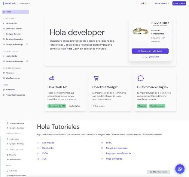
Before: Cluttered layout, missing key actions, and unclear user flow.
💡 Hypothesis
If we clarified the content, improved the site’s structure, and guided users more clearly:
✅ Support requests would drop
✅ Sandbox signups would rise
✅ Devs could integrate faster and more independently
🔬 My Role
Who
🧑🎨 UX Designer
✍️ Me (UX Writer)
Focus Areas
Wireframes · Layout design · Visual hierarchy
Content strategy · Information architecture · Microcopy · UX writing · A/B testing
Collaboration breakdown:
I collaborated closely with Product, Marketing, and Engineering throughout the project to ensure the experience was not only usable—but genuinely useful.
🔍 Research
Competitor audit
Support ticket and PRD analysis
Developer interviews
Alignment with brand voice and tone
✍ Execution
Site-Wide Changes
Homepage copy
New CTAs
Navigation and IA adjustments
Testing
A/B tests
Copy refinements based on results
Key Section Optimizations
Integrations page
Sandbox explanation
Tutorials
🚀 The New Experience
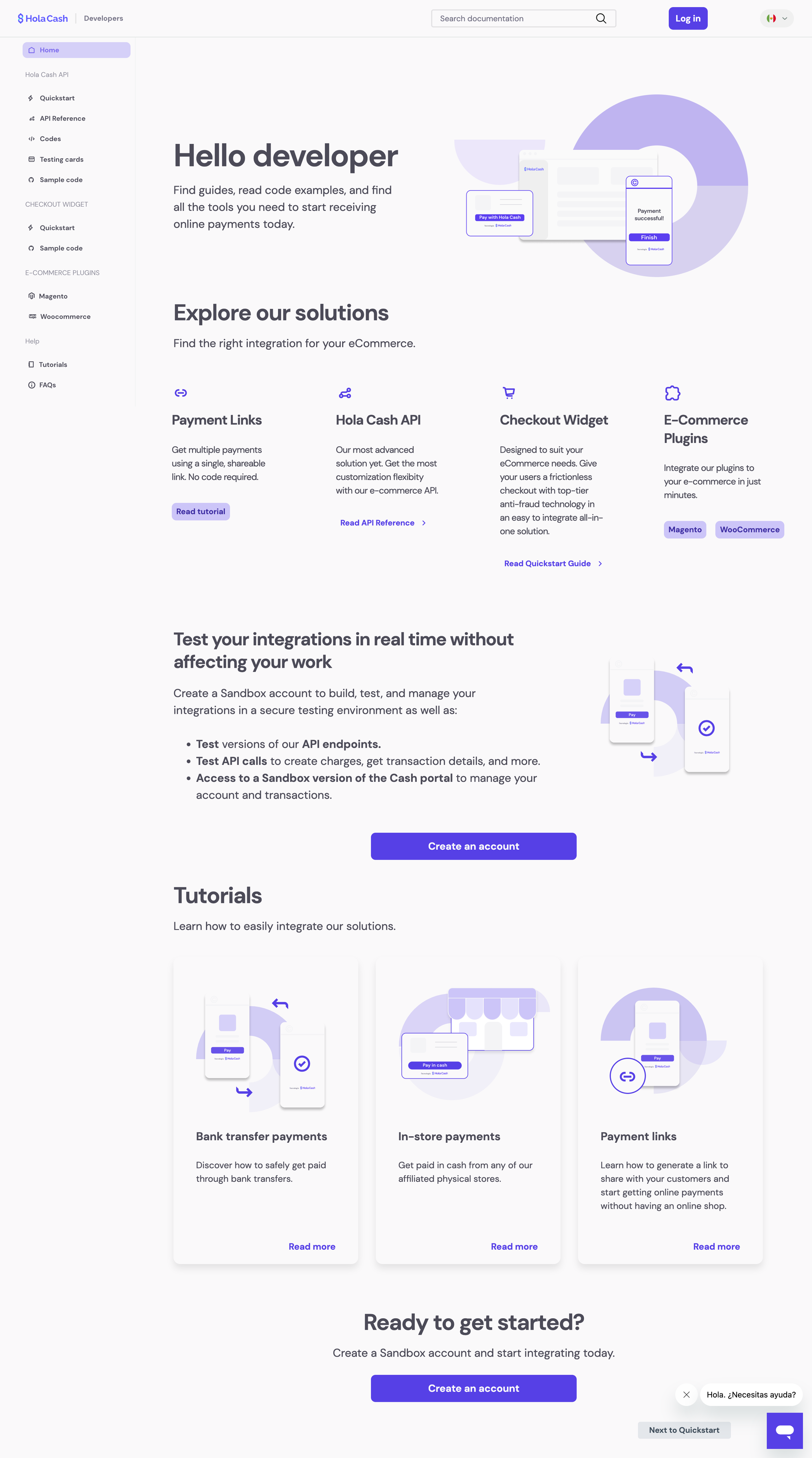
Clean hierarchy, improved guidance, and conversion-focused CTAs.
📈 Results
17% ↓ support tickets
25% ↑ Sandbox accounts
Improved onboarding UX
🎓 What I Learned
This project stretched me in the best ways.
I had to push for user research in a space where it wasn’t initially prioritized—and it paid off. I learned how to simplify complex technical content without losing clarity or usefulness, and how to advocate for decisions that benefit both the user and the business.
It also deepened my confidence working cross-functionally. Collaborating with Product, Engineering, and Marketing taught me how to stay aligned while still leading content decisions with intention and strategy.
More than anything, this project reminded me that great UX writing isn’t just about clarity—it’s about reducing friction, building trust, and moving the needle where it counts.