Designing an e-commerce experience from research to screens — for an audience of passionate, picky dog parents
This project started with a real problem and a (very) real dog, my own Nino.
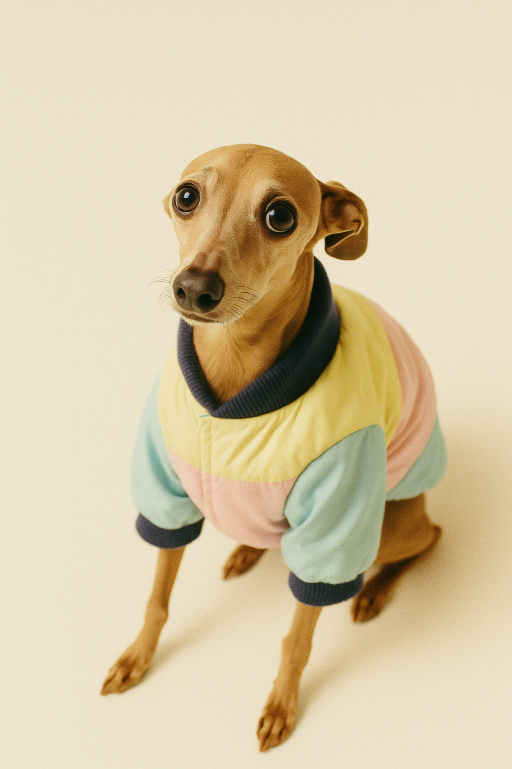
Italian Greyhounds — Iggies — have long legs, tiny waists, and sensitive skin. Nothing on the market in Mexico City fits them well. Owners resort to DIY alterations, children's clothing, or giving up entirely. I know this because I live it. Nino is my Italian Greyhound, and finding him clothes that fit, last, and don't irritate his skin has been a years-long frustration.
So I designed the product I wished existed: Nino's Closet, a premium e-commerce brand for sustainable Iggy dogwear. But this case study isn't about the brand. It's about the content and product design decisions behind it — and what I learned by owning every single one.
I started where any good content strategy starts: understanding the market, then understanding the people.
Research
Competitive analysis
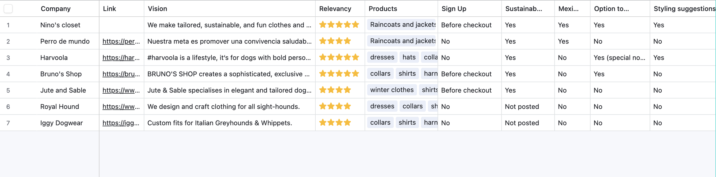
I mapped 6 existing Iggy dogwear brands across product lines, sign-up flows, sustainability claims, customization options, and content presence.
No brand offered sustainable materials, customization, Most had no sign-up flow, none offered styling suggestions, and the brands with the strongest product lines had the weakest content — no voice, no community, no trust signals beyond product photos.
Survey — 28 Iggy owners
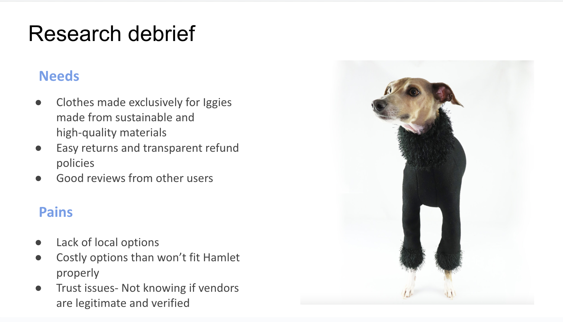
96% buy clothes for their Iggies. The top decision factors were quality (63%) and fit (56%) — and price was the least important factor. When asked about existing options, the response was consistent and blunt: ugly, ill-fitting, and low-quality.
That last finding changed my entire pricing strategy. I'd assumed affordability would be a selling point. The data said otherwise — these owners would pay more for something that actually fit.
Conversation mining
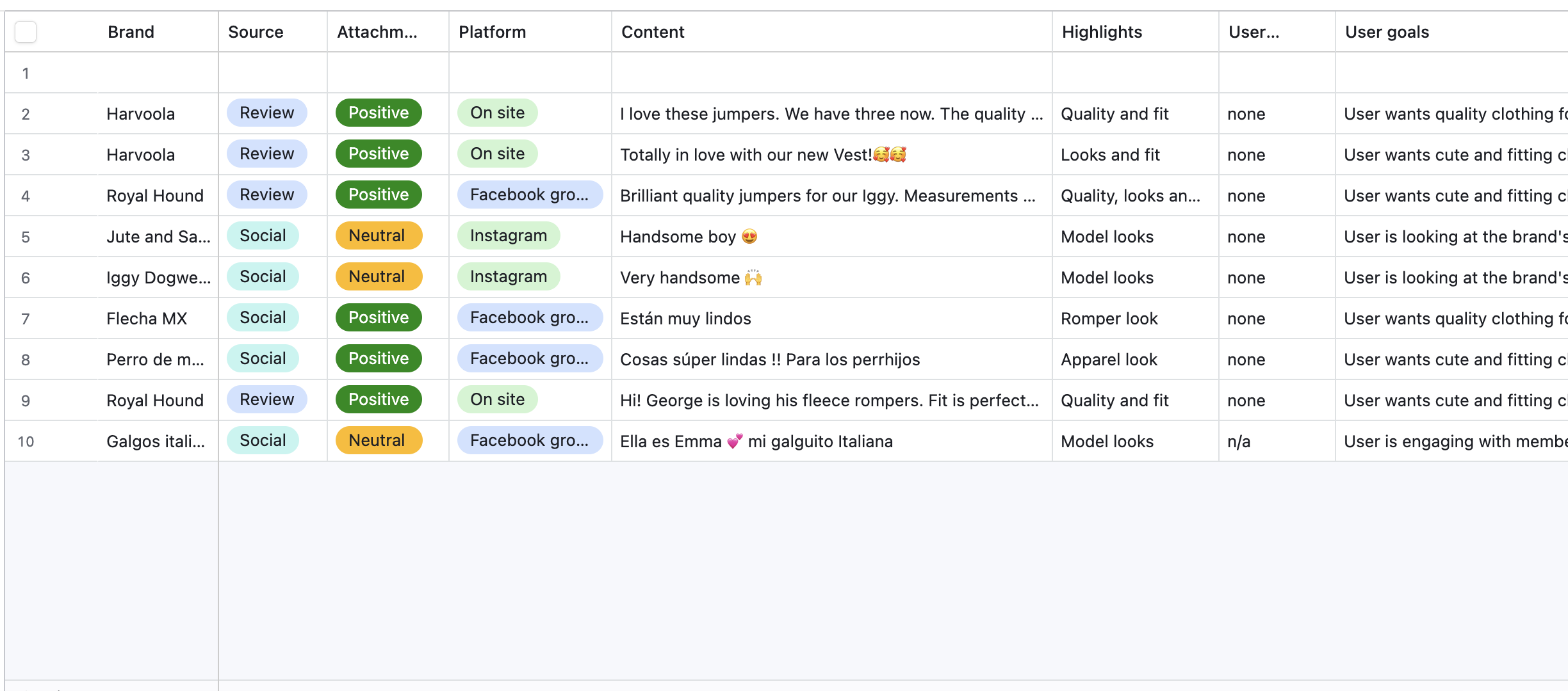
I analyzed reviews, Instagram comments, and Facebook group posts across competitor brands to understand how Iggy owners actually talk about dogwear.
Two patterns stood out. First, the language around quality and fit was intense: owners don't casually mention clothes. They celebrate them or trash them. Second, every positive review read like a love letter. These aren't customers evaluating a product. They're parents dressing their child. That emotional reality shaped every voice and tone decision that followed.
User persona
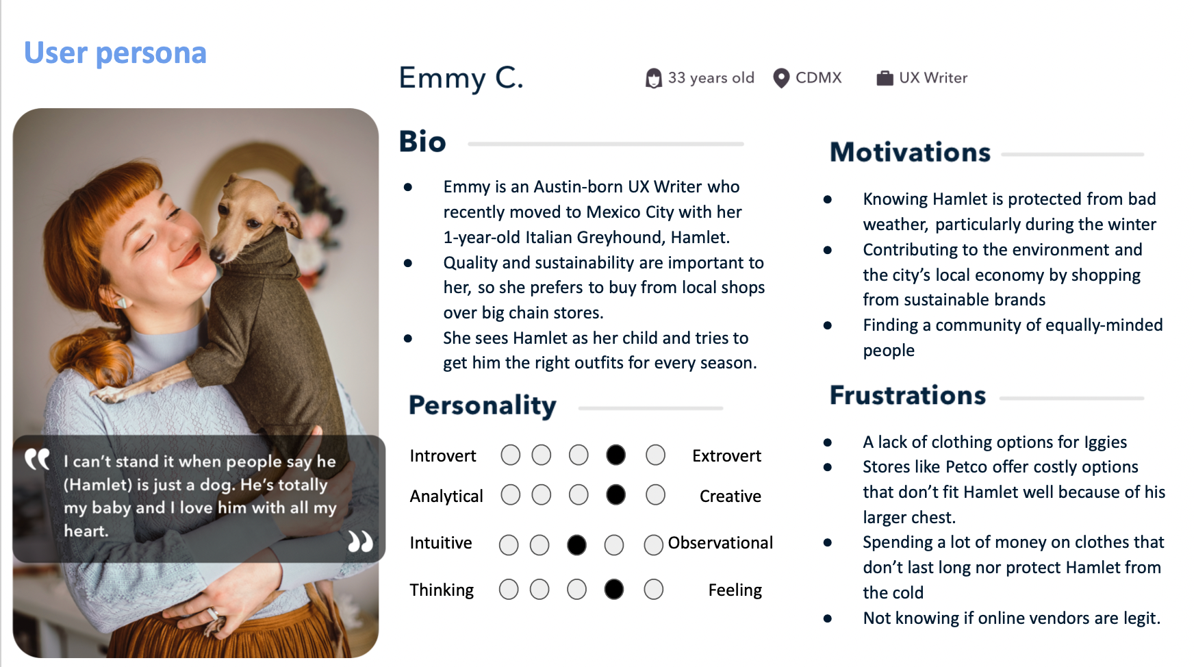
From the research, one profile kept appearing: young, urban, design-conscious, sustainability-minded, emotionally invested in their Iggy, and deeply skeptical of online vendors after being burned before.
Emmy became my north star. Every content decision, from the sign-up modal to the error message, was filtered through one question: would Emmy trust this?
The strategic response

Every pain point and desire mapped to a content strategy decision:
Poor fit → "Finally, something made for your Iggy."
The messaging had to immediately signal that this brand understands the breed. Designed for Iggies, from the ground up.
Cheap materials → Show quality and sustainability across every touchpoint.
Not a single "About" page buried in the footer. Woven into product descriptions, checkout copy, and the brand story on the homepage. The competitive analysis showed most brands either didn't mention sustainability or buried it. Quality was the #1 decision factor at 63% — so the content had to prove it, not just claim it.
Vendor trust → Warm, clear, transparent content with trust-building flows.
Every moment of doubt — sizing, payment, returns — needed proactive reassurance. Easy returns and transparent refund policies had to surface early, not hide in a footer link.
Cause → #SaveAGrey donation flow.
People like feeling part of something bigger than a transaction — and Iggy parents tend to be greyhound lovers across the board. Adding a donation flow would increase trust by showing similar values.
Ideation & feature Prioritization 🧠
I prioritized features using a 4-quadrant framework:
Must-haves, delightful surprises, nice-to-haves, and future features.
This helped me scope the MVP while leaving room to delight users and stand out.

To guide design decisions, I mapped out the end-to-end user journey: from discovery to checkout to post-purchase loyalty. This helped me identify where tone, UX writing, and emotional reinforcement would make the biggest impact.
Journey mapping 🛍️

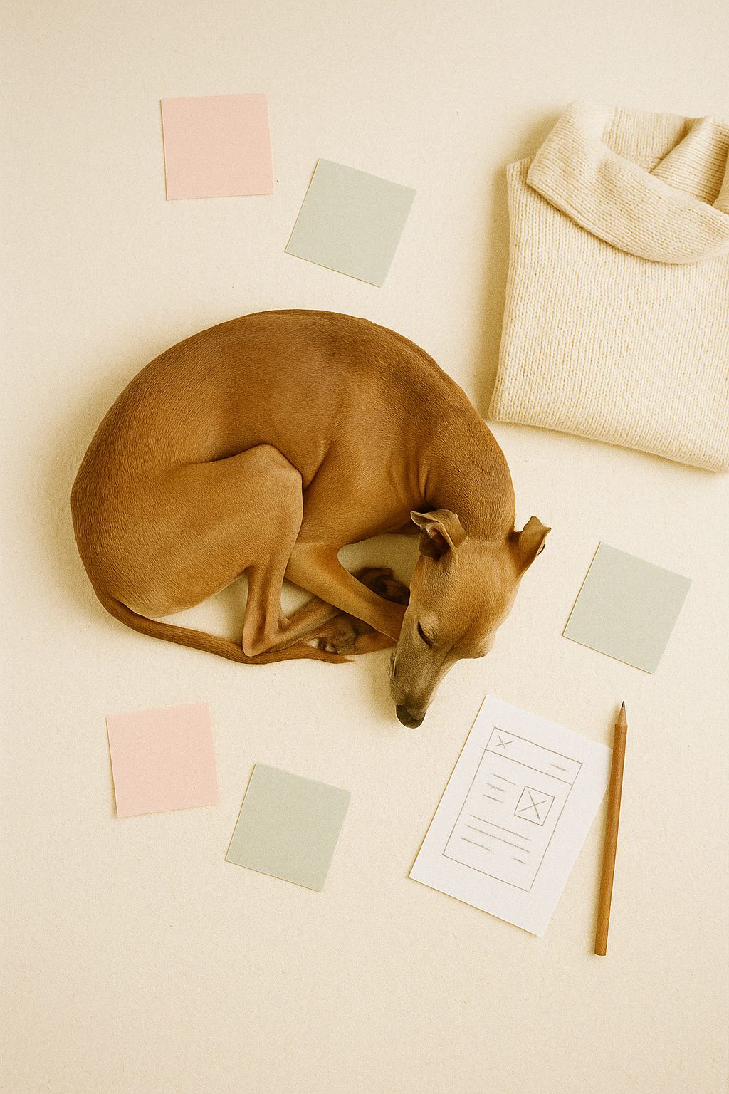
Voice & Tone: Based on the real Nino 🐕🗣️
Inspired by my own Italian Greyhound, I built Nino’s voice to be:
Friendly 🤝
Fun 🎾
Sweet 💕
Cheerful 🐶
And, of course, cute 🥹

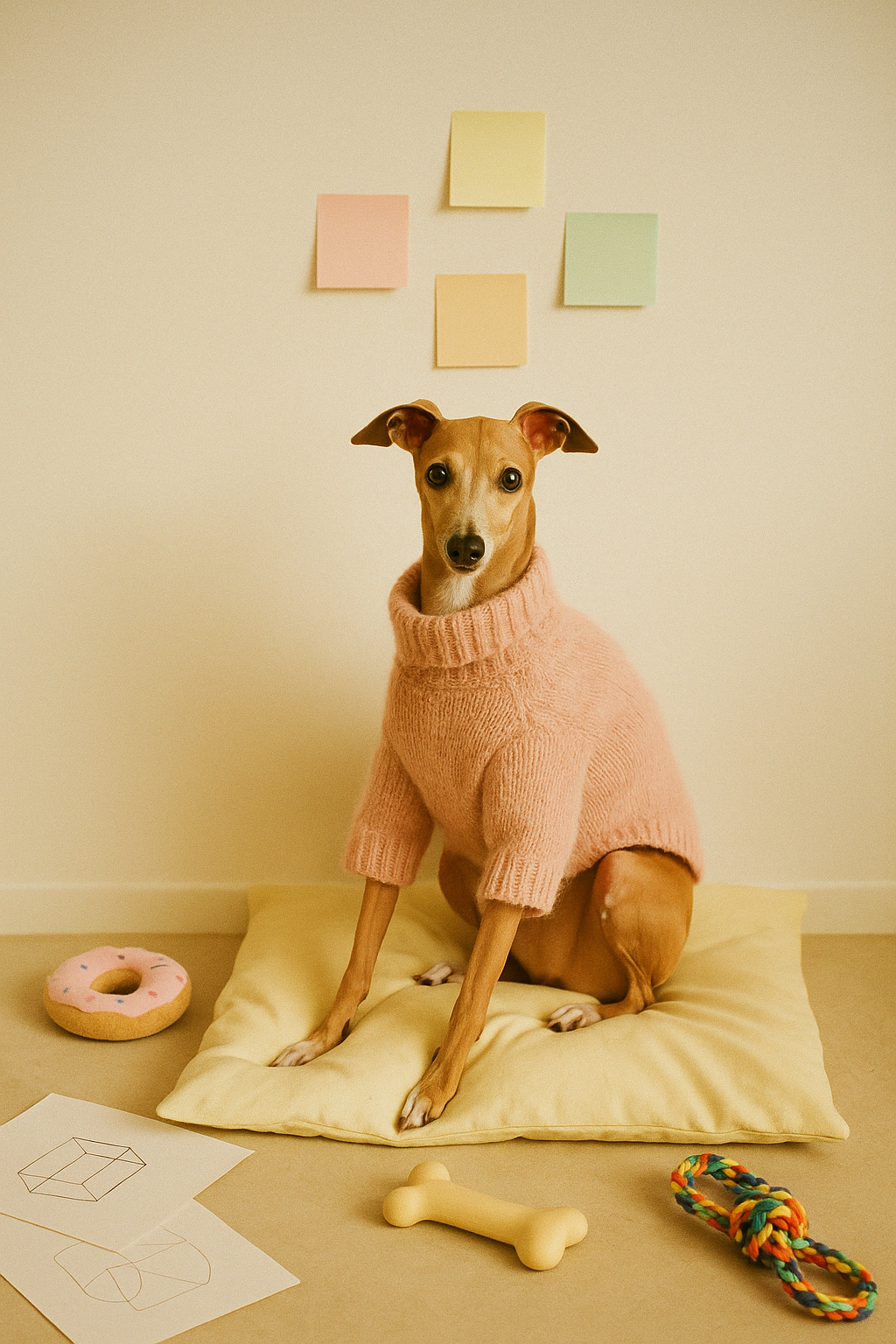
Actual photo of Nino
To keep the tone consistent across every touchpoint, I created a content style guide that included:
Voice and tone principles grounded in Nino’s personality
Grammar and punctuation rules
How to format prices and currencies
Guidelines for capitalization, contractions, and sentence structure
Best practices for writing scannable, accessible content
Do’s and don’ts for UI copy, product names, and calls-to-action
Key UX moments 🖼️
🛎️ Sign-Up Pop-Up

Why it works
Inviting headline: “Join our pack” creates a sense of community and stays true to the brand’s dog-loving tone.
Clear value prop: The 10% discount gives users an immediate reason to sign up.
Playful voice: “Pawsome” adds personality without overwhelming the message.
Clean form design: Lowercase labels and minimal layout keep it casual and user-friendly.
Strong visual cue: The stylish Iggy in Nino gear instantly reinforces the product and vibe.

🛒 Item Description at Checkout
Why it works
Tone that delights: “New human discount” adds warmth and wit by referring to the shopper as a new human rather than a new customer. It keeps the voice dog-first and charming.
Clear savings: The original price is struck through and the discounted price is bolded—instantly readable and conversion-friendly.
Friendly visual hierarchy: Product name is bold, discount is secondary, and pricing is clear—making it easy to scan during checkout.
Consistent brand language: Using terms like “onesie” instead of “jumpsuit” feels playful and on-brand.
Image reinforces product: The tiny Iggy photo makes the product recognizable at a glance, keeping things visual and lovable.
💗 “Save a Grey” Donation Flow

Why it works
Purpose-driven messaging: “#SaveaGrey” introduces a social cause in a way that feels branded and community-focused.
Positive framing: “Your purchase alone helps…” reassures users that they're already making a difference—donating is an extra, not a pressure.
Friendly, approachable tone: “If you like :)” and “You are the best human in the world” add warmth and charm, keeping the UX non-judgmental and smile-worthy.
Simple decision-making: Pre-set donation amounts (5%, 10%, 15%) make it easy to choose, while the “None” option keeps it low-pressure.
Custom option for flexibility: Allows users to personalize their giving—great for accessibility and user autonomy.
🚫 Error Message (Card Entry)

Why it works
Wrote this clearly and directly—no jokes here. Helpful, accessible, and polite.
“Error messages should never be cute. They should get users back on track quickly.”
Final screens 🎨
Designed in Figma (with lots of coffee ☕). I introduced the brand mission and value proposition early to build instant credibility and connection with new users.
Outcome & Validation 🐾
While Nino’s Closet was a concept project, the response was anything but hypothetical.
💬 100% of the people I interviewed or surveyed said they’d shop from it — no questions asked.
That kind of feedback, especially in a niche market, signals strong product-market fit and clear user resonance from day one.
What I learned 📚
Managing this project solo—from research to iteration—was a crash course in creative leadership. I:
Balanced strategy and storytelling
Created brand voice from scratch and applied it across screens
Prioritized accessibility, plain language, and clarity
Ran a guerrilla-style A/B test with peers at Hola Cash for validation
Juggled this with my full-time job—learning to prioritize, plan, and pivot
Final reflection 🐕
Nino’s Closet was playful, yes. But for me, it was personal.
I poured my love for Nino into every screen, every word, every decision. I got to blend storytelling with strategy, build trust through content, and shape a brand that felt joyful, intentional, and totally unique.
To this day, it’s the most fulfilling project I’ve worked on—and the one that reminded me why I love what I do.