


PLATA Inversiones
How one landing page earned Content Design a seat at the strategy table
PLATA was already a household name in Mexico for credit cards and payments. Now they were launching their first investment feature. The brief seemed straightforward: "The landing page designs are ready for copy edits."
But I wasn't interested in copy edits. I was interested in the story we were telling people about their money — and whether we were telling it honestly.
This is the story of how a single landing page changed the way PLATA thinks about Content Design.
Context
On the surface, this was a landing page project. Underneath, it was three problems stacked on top of each other:
A trust problem. Digital fraud in Mexico had surged — 27% in Q1 2025. People weren't just skeptical of new financial apps. They were scared. Every word on this page had to earn credibility before it could ask for a sign-up.
A clarity problem. Our target users wanted to invest but felt shut out by financial jargon. Terms like "ETF" and "diversification" made them assume investing wasn't for them. We needed to educate without condescending — and make wealth-building feel accessible, not exclusive.
A process problem. Content Designers at PLATA were "scribers" — brought in at the end to edit, translate, and get Legal approval. We weren't in strategy meetings. We weren't shaping the narrative. We were polishing after everyone else had decided what to say.
I wasn't going to wait to be invited into strategy. I was going to create it.
2. How I got in the room
I organized the first cross-functional content kickoff meeting in PLATA's history. Not a "what copy needs approval?" meeting. A strategy session.
I summoned Product, Design, Marketing, Legal/Compliance, and the Head of Investments into a single Meets meeting and set the agenda:
What does our positioning — "intuitive + for wealth-builders" — actually sound like?
What's the emotional journey from skeptical visitor to confident investor?
What are users' biggest fears, and how do we address them on this page?
How do we move forward — together?
That meeting changed the dynamic. For the first time, Content Design was shaping the strategy, not executing someone else's.

Collaboration doesn't mean agreement. It means navigating disagreements well. Here's where I had to fight for the right call:
The "First investment app" problem.
An early draft of the hero positioned PLATA Inversiones as "Mexico’s first investment app." I flagged this immediately — it was a compliance risk and, frankly, dishonest. Plenty of investment apps existed in Mexico. Claiming "first" could expose us legally and undermine the trust we were trying to build. I proposed "The first all-in-one investment app" — specific, defensible, and still aspirational. It took a few rounds, but it stuck.
The cognitive load battle.
Stakeholders wanted to pack the landing page with features, disclaimers, and educational content. I pushed back using marketing's own data on user drop-off and UX writing best practices around scannability and progressive disclosure. My argument: if we overwhelm people on the landing page, they'll never make it to the product. We don't need to teach everything here — we need to build enough confidence for one action: create an account. We cut roughly 30% of the proposed content and restructured the hierarchy around emotional progression, not feature lists.
Advocating for the user's emotional state.
Several stakeholders wanted to lead with product features. I advocated for leading with value and reassurance first, features second. Using insights from Marketing's research on our target users, I made the case that someone who's nervous about their money needs to feel safe before they'll care about what you're offering. The final page leads with "Make your money work for you" — benefit-first, not feature-heavy.
3. Where I pushed back
For the first time, Content Design shaped strategy instead of executing it.
4. How I built it
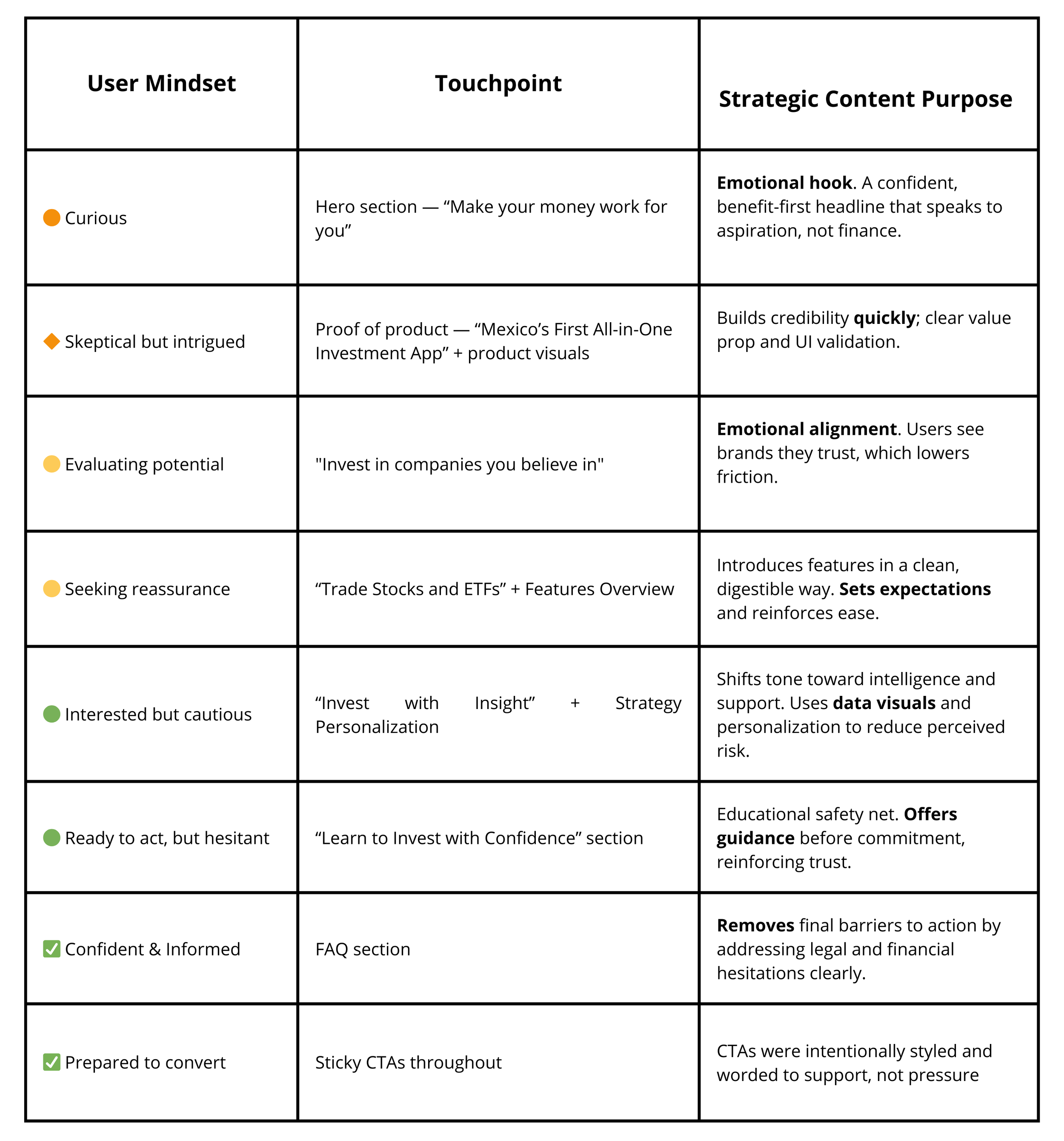
Once the strategy was aligned, I used the content patterns I'd established in PLATA's style guide to write every component systematically — titles, subtitles, CTAs, body copy, disclaimers — each with a clear role in the page's emotional arc:
Hook → Educate → Reassure → Act.
Every section had a user mindset mapped to it. "Make your money work for you" (aspiration). "Invest in companies you believe in" (identity). "Your money. Your strategy." (control). "Start with as little as $1 USD" (remove the last excuse).
I wasn't writing copy in isolation. I was working inside Figma alongside the product designer, iterating on hierarchy and layout together — because content and design are the same conversation. When we disagreed on emphasis or placement, we talked through the user's mindset at that point in the page and let that be the tiebreaker.
Once the content was approved across all stakeholders, I updated the CMS directly to help developers push it into live staging. I didn't throw a doc over the wall and wait — I stayed in the process until the words were actually live and rendering correctly.
5. The results
~1,000 accounts created in the first 24 hours via the "Create a free account" CTA.
Cross-functional teams repurposed the messaging across email, ads, and support — reducing content production time for subsequent campaigns.
Stakeholders were happy with the collaboration cadence and process. Product, Legal, and Growth leads cited this project as a model for how content should be involved going forward.
Content Design earned its seat. This project made the case for involving Content Design early in the design process — not as editors, but as strategic partners. After this launch, I was included in kickoff meetings for subsequent product initiatives.

Full scope
Beyond the landing page, I also owned content design for the full PLATA Inversiones launch: onboarding flows, microcopy systems (error states, empty states, confirmations), Spanish localization, and updates to PLATA's content style guide with trading-specific standards that were adopted across three product teams.
What I'd do differently
Build content ops from day one. Establish clear review workflows and reusable templates earlier so future teams can move faster without relitigating the same decisions.
Push for user testing on the landing page. We launched based on strong research and stakeholder alignment, but I wish we'd had time for a round of usability testing on the page itself before going live.