


Money Canvas
How advocating for bilingual coaches changed the way Thrivent builds for Spanish-speaking users
When I joined Money Canvas, I was asked to fix some Spanish translations. What I found was bigger than bad copy — it was a system failure that was costing Thrivent its bilingual coaches, and with them, access to the Spanish-speaking users who needed this program most.
This is the story of how I turned a translation cleanup into a comprehensive bilingual content system — and why I had to fight for the right to do it.
What I walked into
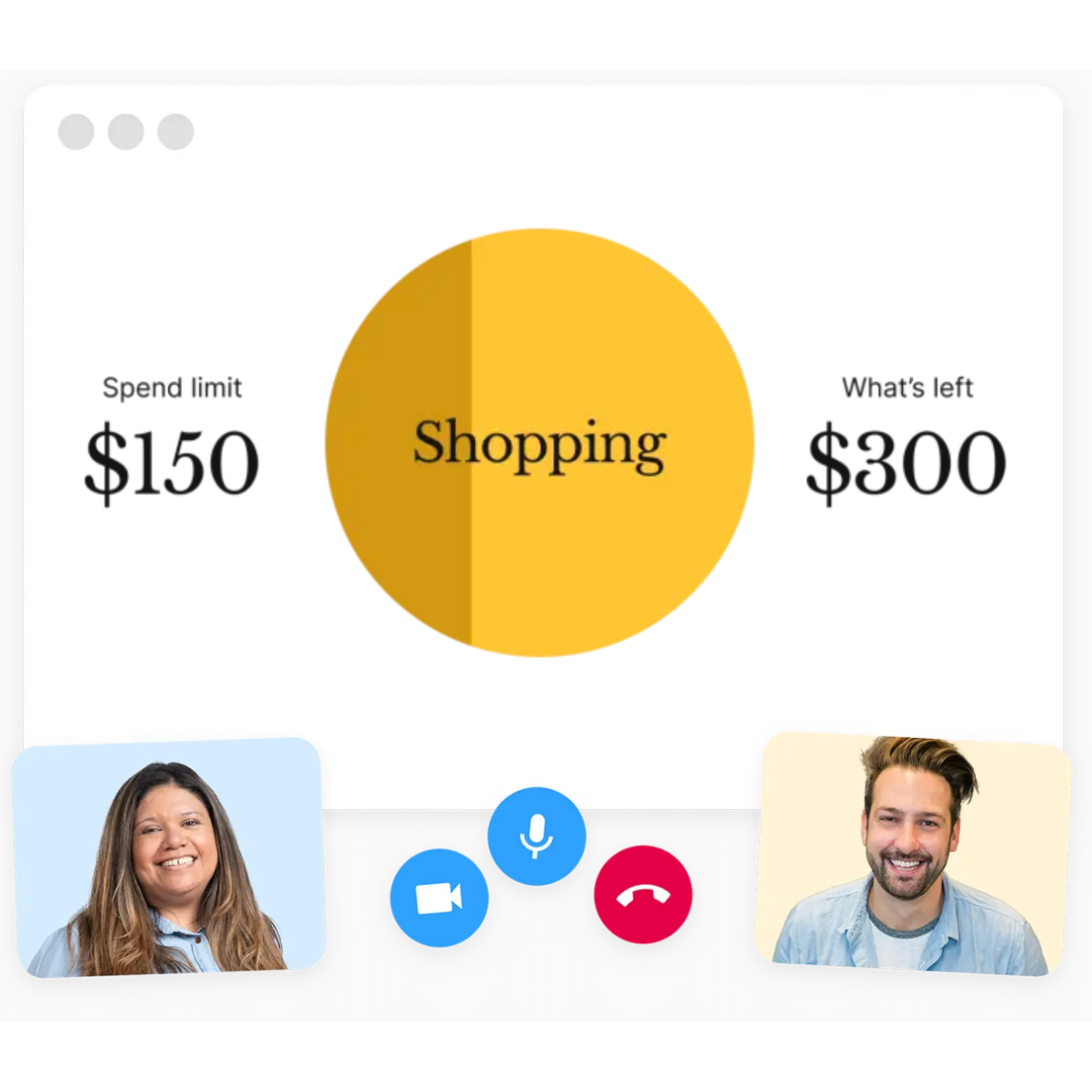
Money Canvas is a three-session financial coaching program supported by a web app. The English experience was mature. The Spanish experience was falling apart.
The translations were being done by Salvador — an ops team member, not a translator. There were no guidelines, no glossary, no quality standards. The result was choppy, literal translations with inconsistent terminology and tone that sounded robotic in Spanish.
The Multicultural Experience team had no framework to support translators. Every translation was a one-off decision. Different teams — Product, Growth, Multicultural, Session Experience — were creating Spanish content in silos, with no shared reference for what "good" looked like.
The landing page wasn't even translated. Which meant fewer Spanish-speaking users were being reached in the first place.
And the coaches were leaving. Bilingual coaches — the people actually delivering these sessions — felt unheard and unsupported. The Spanish content they were working with didn't match the warmth and clarity they brought to real conversations. They were improvising fixes mid-session, and some had stopped leading bilingual sessions entirely. Fewer coaches meant fewer sessions. Fewer sessions meant fewer families getting access to financial coaching in their language.
This wasn't a copy problem. It was an access problem.
How I reframed the ask
I was hired to fix translations. But after auditing the Spanish content and interviewing bilingual coaches, I realized fixing individual translations was treating the symptom, not the disease. The real need was a system — guidelines that could scale, that could help any translator or content creator produce quality Spanish content without depending on one person's judgment.
I presented my findings to my manager and the PMs: here's the state of the Spanish experience, here's what coaches are telling us, here's what it's costing us, and here's what I recommend instead.
The trade-off was real.
I had three months. I could either spend that time translating a volume of screens, or I could build the content guidelines that would make every future translation better. One addressed the backlog. The other one scaled. I advocated for the guidelines — and got the green light.
This didn't happen in a vacuum. Before this project, I had already met with PMs to understand their needs, discuss the cost of not translating the landing page, and build relationships across teams. When I made my case, I had their support because they'd already seen how I thought.
The research that made the case
I didn't build the system from mere assumptions, but from three layers of research:
A Spanish content audit
Across Product, Growth, and Multicultural touchpoints. I found literal translations that sounded unnatural, tone mismatches across sessions, financial terminology that was overly formal or unclear, labels misaligned with users' emotional states, and fragmentation between teams creating conflicting patterns.
Interviews with bilingual coaches
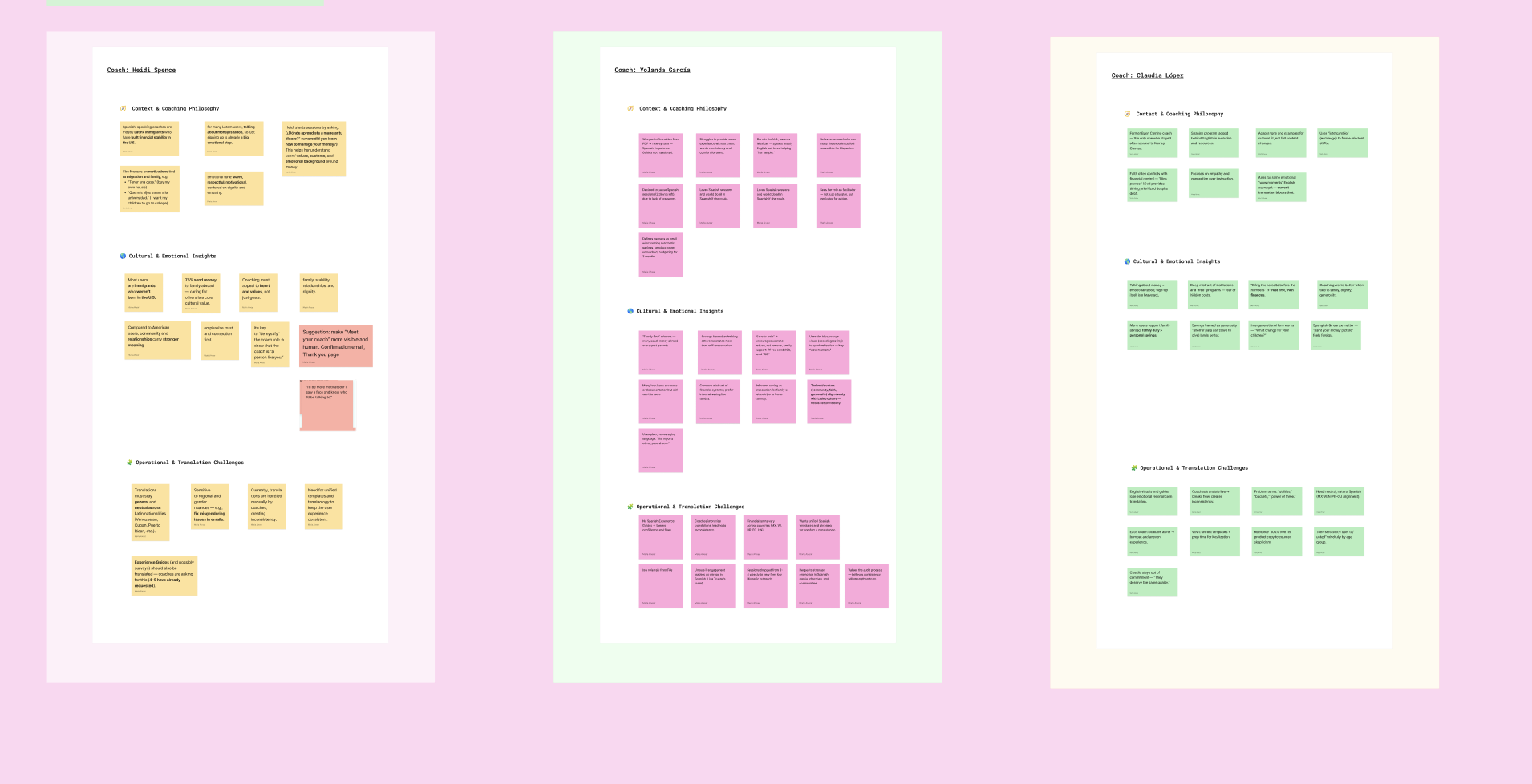
This was where the real insights lived. Coaches told me Spanish-speaking users value explicit confirmation, not implied meaning. Emotional reassurance is culturally essential. Hyper-short English microcopy often can't be translated 1:1. Users respond better to gentle, relational phrasing than direct imperatives. And coaches were already "fixing" the product's Spanish in real time — the system was relying on improvisation.
An undercover session assessment.
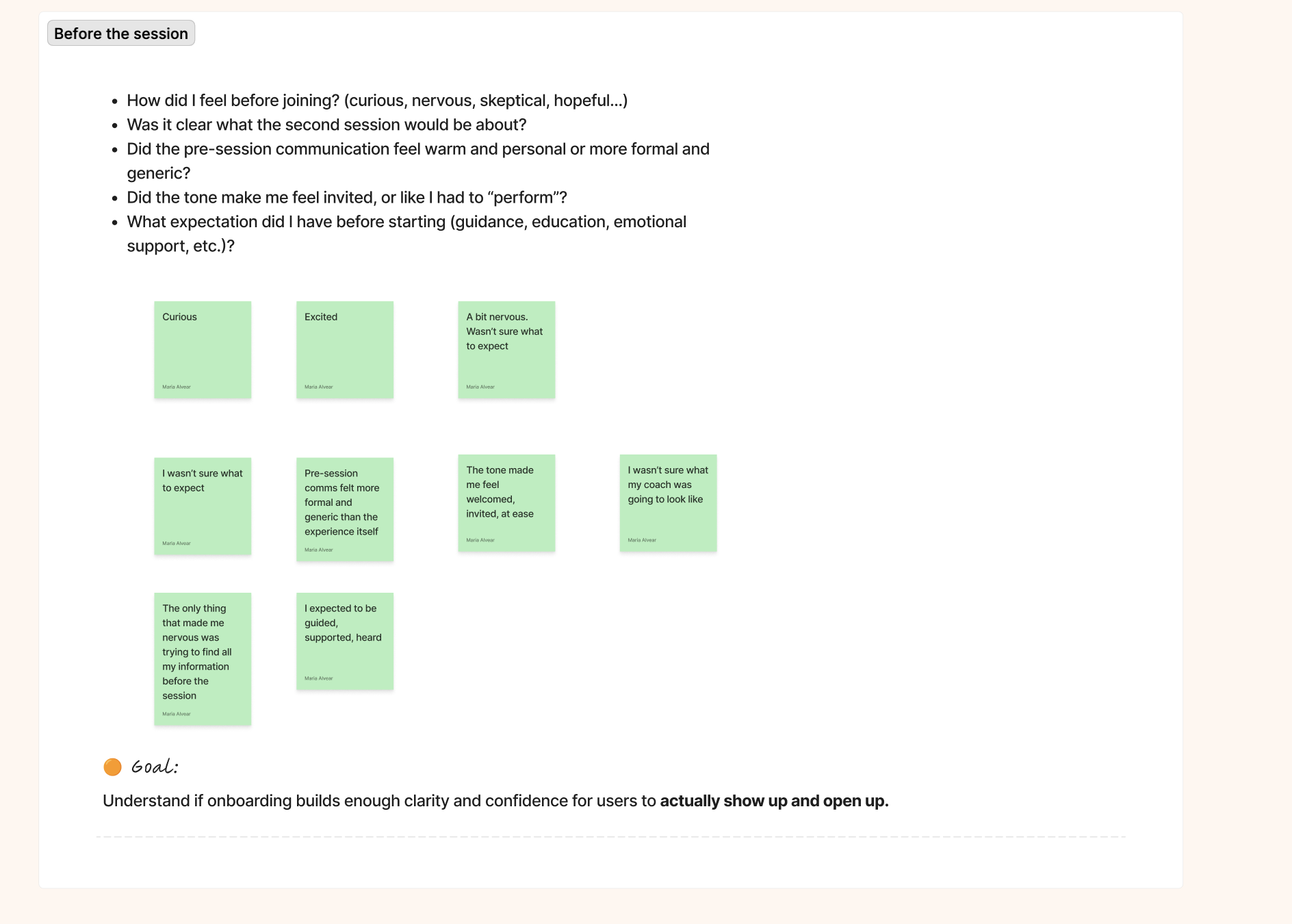
I underwent the entire program experience to see how the Spanish content performed in context. I watched where the coach had to clarify or rephrase, where users hesitated, and where the written content created friction that the coaching model didn't intend. The gap between what the product said and what coaches actually delivered was significant.
What I built
Every decision I made on this project ran through the same four questions: What does this copy need to achieve? How should it feel in Spanish? How do Spanish speakers naturally express this idea? And what's creating noise?
Those weren't a framework with a name. They were the criteria I used to evaluate everything — the audit findings, the translation decisions, the QA checkpoints. They're why the system has internal logic instead of just rules.
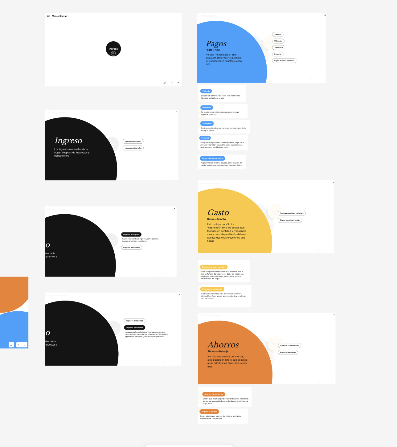
The content guidelines — for both languages
This is the part that often gets reduced to "she built a Spanish style guide." That's not what happened.
I audited every component in the design system — buttons, labels, empty states, error messages, form fields, session prompts — and defined content rules for each one in both English and Spanish. Tone requirements. Character constraints. Terminology decisions. When to adapt vs. mirror. What each component needs to achieve at that moment in the user journey.
For the first time, there was a shared reference for how content should behave at the component level, not just how it should sound in general. Designers had documented patterns. Translators had rules grounded in context, not guesswork. And the English experience got sharper too — because defining the rules for Spanish forced clarity about what the English was actually trying to do.
A hybrid translation model
Not all content translates the same way. I built a three-level model:
Literal — only when precision is critical (legal, financial terms)
Cultural adaptation — adjusting for clarity and emotional safety
Light transcreation — when English structure doesn't transfer meaningfully
Each guideline included the user, the content surface, the moment in the journey, the intended approach, and concrete good vs. bad examples. Translators had a framework for judgment, not just a checklist to follow.
A QA rubric for self-assessment
Built from real friction patterns surfaced in the audit and coach interviews. Not vague direction like "check the tone" — specific, evaluable checkpoints:
Does this feel overly formal for a coaching context?
Is this sentence speakable for live session delivery?
Does this preserve user dignity around sensitive money topics?
Is terminology aligned with the glossary?
Translators could evaluate their own work without waiting for centralized review.
A proposed collaboration flow
A process change, not just a content deliverable. I recommended that designers involve translators earlier — providing UI constraints, component context, and intent — instead of handing off finished screens after the fact.
This was about fixing the upstream problem. Bad translations are often a handoff problem before they're a language problem.
An AI-assistive layer using Copilot
(Covered in the next section — this one deserves its own space.)
How I used AI (and why it matters)
I used AI to build faster across three phases, and the role it played in each one was different.
Phase 1: Research design and synthesis
Before I interviewed a single coach, I used AI to help me design the research framework itself — structuring question sets from my research objectives, defining what to look for during the session assessment, and building a categorization system for organizing findings.
After each interview, I fed my notes back in and used this prompt to synthesize insights:
You're helping me prepare for and synthesize findings from interviews with bilingual financial coaches. I'm working on a bilingual content system for a financial coaching platform. Coaches work with Spanish-speaking users who are navigating money topics in their second language.
For each interview, I want to understand two things:
The users (through the coach's eyes): How do users come into their first session emotionally? What are the a-ha moments? Where do cultural or language nuances change how a concept lands? What words do users actually use? Where do English-designed materials fail them?
The coach's operational reality: What's their coaching philosophy? Where do they hit friction with current translations? What do they end up adapting, rewording, or skipping? What would make their job easier?
After each interview, synthesize findings into sticky-note-sized insights organized by: coaching philosophy, cultural and emotional insights, and operational and translation challenges. Keep each insight brief, clear, and observational — no solutions yet.
This kept synthesis structured and consistent across all coaches — so I wasn't pattern-matching from memory, I was working from documented evidence.
Phase 2: Auditing content against emerging criteria
As I was developing the guidelines, I used AI to pressure-test them against real content — running existing copy through this prompt to catch issues before the rules were finalized.
Phase 3:Building and scaling governance
With research complete and criteria validated, I used AI to draft style guide sections faster, articulate tone principles clearly, and stress-test QA criteria before documenting them.
The final piece was a Copilot master prompt — embedded directly in the style guide under "Writing with AI." Designers and PMs used it to draft aligned copy during wireframing. Translators used it for lower-stakes content. Everyone could audit copy before it went into review.
It returned a short rationale alongside every output — not so the team would accept AI output, but so they could push back on it intelligently.
Four iterations to get right. Worth it.
Translations: Before and after
Web app session

Original English version
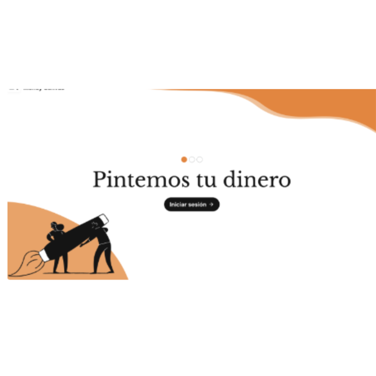
❌ Literal translation sounds more like users will color their dollar bills instead of creating their financial picture
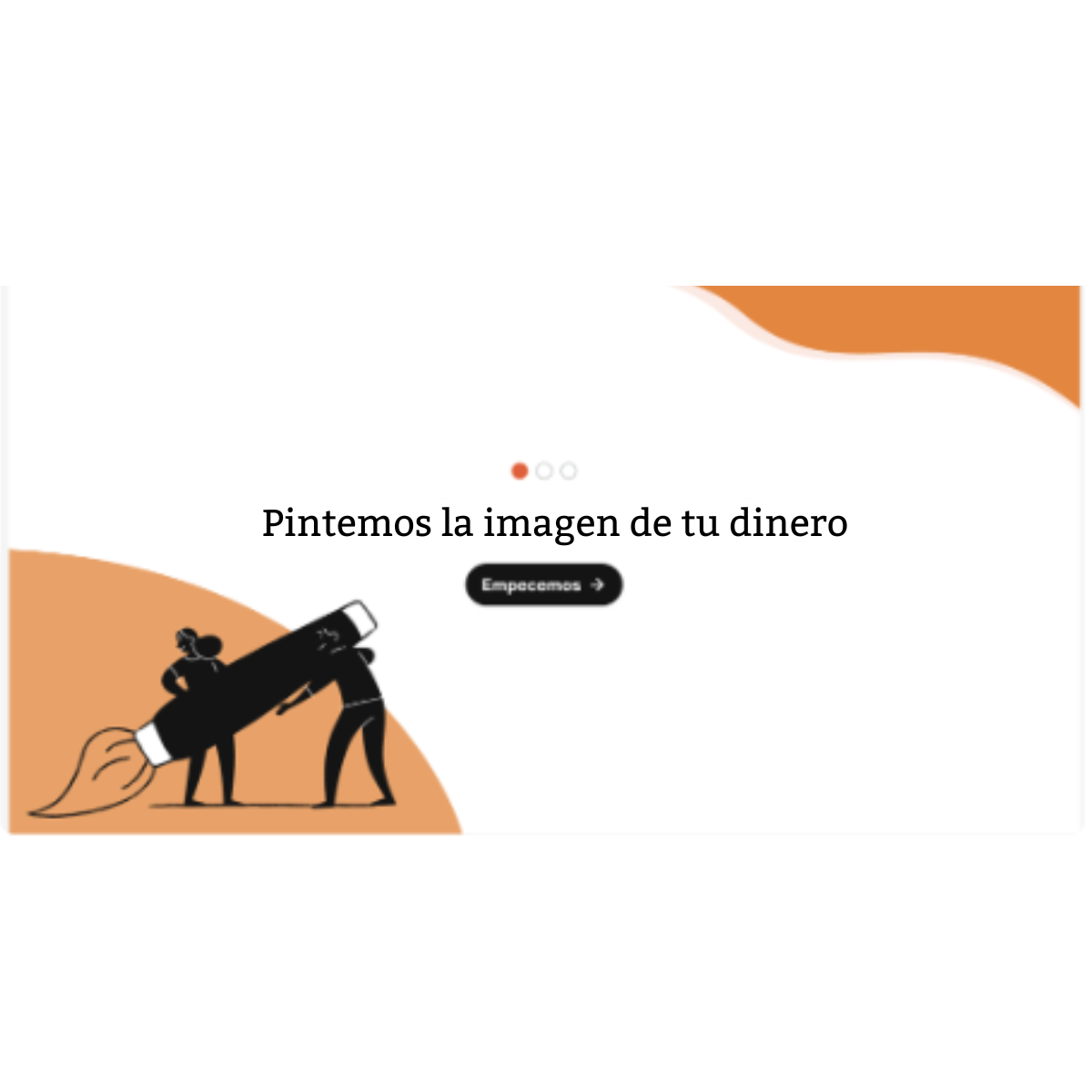
✅ Culturally adapted translation. Keeps original meaning and the intent
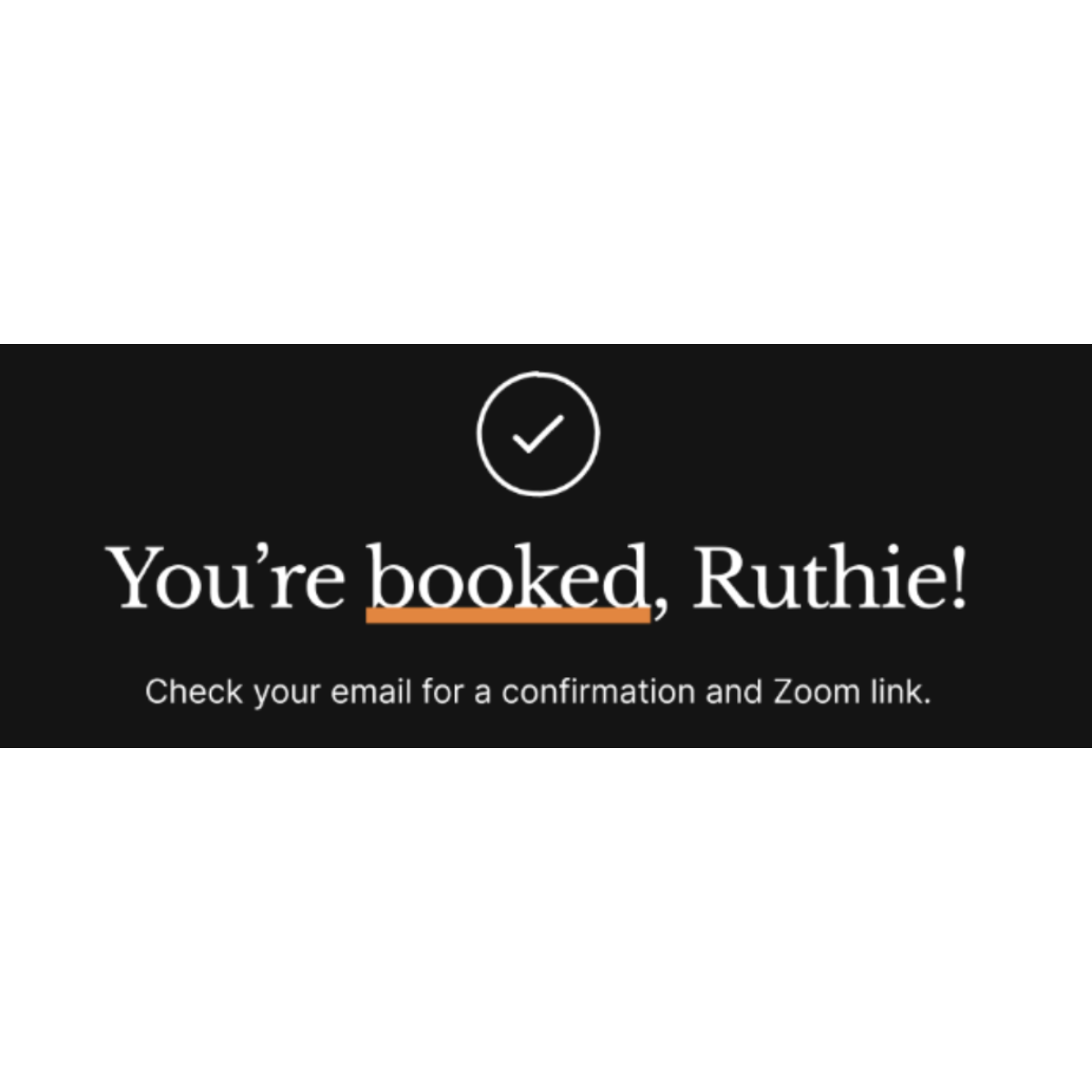
Booking confirmation
Original English version
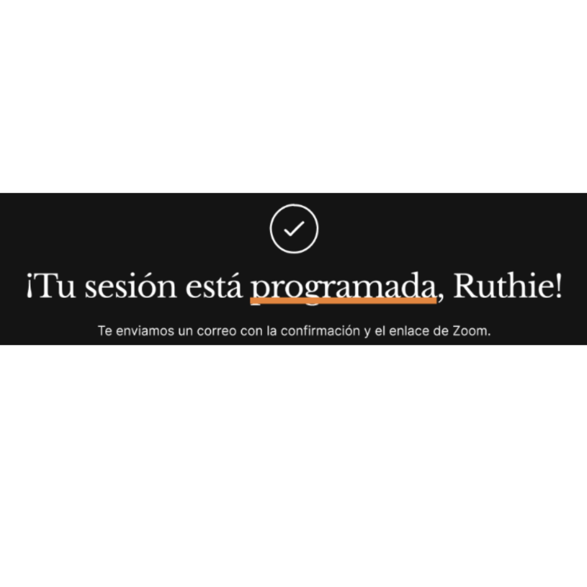
Translated version adapted to meet Hispanic users’ expectations and trust needs
Session prompt

Original English version

Warm, relational, and aligned with the coaching voice
Yes, it took more time. But it was the best way stop more content debt from piling up.
My impact
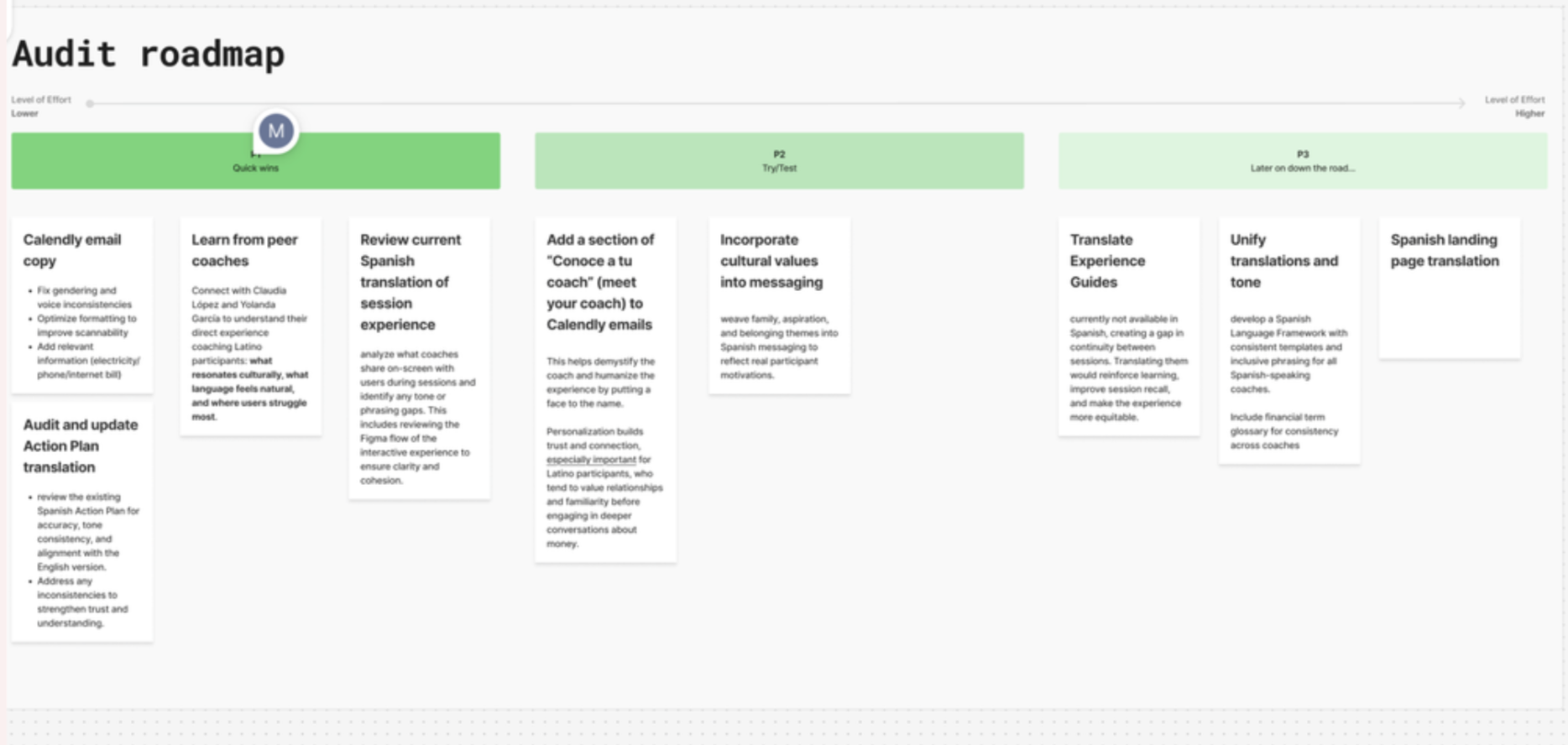
Created a backlog of content tasks and a roadmap built directly from the audit and coach interviews, so the team knew exactly what to prioritize after my contract ended.
Translators had a validated framework. The localization manager reviewed and approved the guidelines, giving them institutional weight — not just one contractor's opinion.
Content designers now had documented content patterns aligned with the design system. For the first time, there was a shared reference for how content should behave at the component level, in both languages.
Got the ball rolling on Experience Guide translations — the core coaching content that had been stuck in English.
Coaches felt heard. The resources they'd been asking for finally existed. The system was designed around their reality, not around an idealized version of how translation should work.
And the program became more accessible to the people it was built for.

What I'd do differently
Push for the landing page translation within my contract
I made the case for it and had PM support, but time constraints meant it didn't happen on my watch. I'd scope it in from the start.
Run comprehension testing with Spanish-speaking users.
The system was validated by coaches and the localization manager, but direct user testing would have strengthened the case further.
Choosing to build guidelines instead of translating screens felt risky in a three-month contract. The temptation to show visible output is real. But one scaled and the other didn't. Sometimes the best advocacy for users is convincing stakeholders to invest in infrastructure instead of speed.